 This is an eery picture of a “biker chick “woman whose body is made up of a red pepper. The color of her skin matches the look on her face; angry and serious.
They must have made this in photoshop. The direst selection tool was used to cut out the pepper and layer the face and pepper so who when the skin was erased, the pepper showed through. Different tools such as the burn tool, patch tool, and the white paint brush were used to make the skin look exactly like a red pepper.
The red color really stands out in this piece because it is the focal point of the page, and it is very bright. The smooth texture makes it very believable that her skin is the outside skin of the pepper.
 This is a man whose face looks like it is made of a magazine. I find this picture to be very creepy and a little odd. I am not sure whether or not this is an advertisement for a product, or just a piece of art.
This was definitely created in photoshop. They must have take multiple pictures of the man and, cut and placed it so it looked like his head was opening up. As far as the lines on his face, I am not sure how that was accomplished. The magazine pages were probably cut from an open magazine and blended together with the face. It looks as though the pages and skin overlap creating the magazine pages texture. This particular piece of art looks difficult to make because of all the detail involved.
Texture and movement are prevalent in this pieve. The way he his holding the pages helps you imagine his entire face flapping like someone was scanning through a book very quickly. The texture of his skin and magazine make it look as though his entire face is made up of paper pages.
 This is an illustration of a snail on a leaf, however it looks as though everything is made up of liquid. I believe this is just an illustration because there is no product or text showing that it is an advertisement.
I believe this was made in photoshop because the water droplets look too realistic to be made in illustrator. The main tools that were probably used in this piece were “liquify” and the paint brush “color” mode to make the liquid, and the burn tool was used to create the shadows.
The piece really emphasizes the use of color and texture. The black background makes the color stands out tremendously, and the the use of gradients and shape really make the texture look like water.

This is a Nike 6.0s shoes advertisement. The splashing paint looks like it is coming together to form the shoe, or the shoe look as though it is melting and being blown away.
This advertisement looks as though it was made in photoshop. The shoe and the paint were cut out using the selection tool. The two different textures were blended together using the the blur or spot healing tool. The background is made up of a rough texture. The burn tool was used at the bottom of the ad to show some dimensionality.
Texture and color are two elements that are most prevalent in this ad. The soft and smooth textures on the shoes contrasts with the shiny and wet texture of the paint. The white background makes the colors of the shoes stand out significantly.

This looks like an foreign advertisement for for a watermelon flavored water. It looks as though the “water”melon is made up of water and seeds.
I believe this was made in photoshop. The rind of the watermelon was cut out using the selection tool, and was then blurred so it would transition easily to the water. the water was also cut out using the selection tool and blended with the rind. The seeds were also placed using the selection tool. The background looks as thought it was made using the gradient tool, and a drop shadow was added to the watermelon.
Texture and movement are two important aspects to this advertisement. Having the water look realistic with the reflection rather than just drawing a liquid shape better advertises the product they are selling. The angle the watermelon is, and they way the water is splashing out shows, movement of the watermelon itself, rocking back and forth.
 This is an advertisement for or flyer for the “Mile High Climb.” However the shape of this makes me believe that it could be a cover for a brochure. It looks to be a mountain logo with type underneath giving all the information need about the climb.
This look as if it was made in illustrator and photoshop. The mountain was cut out of a rock photograph using the pin or selection tool. The clouds, circle, and flag were made in illustrator using the pin tool and ellipse tool. The text underneath was made using the text tool and the align tool to make it all line up nicely.
Shape and color are most prominent in this piece. The overall piece has a rectangular shape with the contrasting shape of the circle. The mountain is very simple using jagged triangular shapes. I find it interesting how different typefaces and sizes were used but they all fit nicely in the rectangle. Color seems to be important because if it was just one color it would make the layout boring, and if there were multiple color, everything would look too busy.
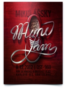
 This looks to be an advertisement for a shoe brand. The shoelaces spell out “mine jam,” but I am not sure how it pertains to the shoe itself. The shoes themselves look like Vans. I believe it is for a foreign company because of the text surrounding the shoe.
I believe this was made in photoshop. The shoes were cut out using the selection tools, and the shoelaces were twisted to form text with the puppet warp tool or liquify tool. The shadows were made by with the burn tool. The background looks as though there is some type of texture, so they must have used the paintbrush “color” tool and made the photograph a deep red. They also added a drop shadow to the shoe and laces.
The elements present in this advertisement are color, movement, and line. There multiple shades of red showing dimensionality. The shoelaces show movement by using lines that are curved and swirl around the show. Overall this advertisement look very realistic yet imaginative.

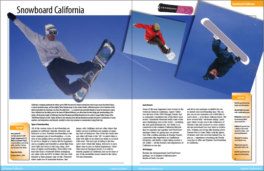
This was made using indesign and character styles in order to easily make all of the text the same. We also added gradients, photos with drop shadows to add more interest.